AFE ×Rebranding
A new identity for the Spanish Footballers' Association: logo, symbol, colour, typography and all its applications, from stationery to the official launch.
AFE refreshes and modernises its identity to keep conveying its values and purpose: to guarantee the best defence of footballers' interests. Respecting its essence and reviving elements of previous logos, we built a flexible brand on clean, dynamic and modern geometry.
1 · The story
A renewed collective, with the same history as ever.
Update the image of an association founded in 1978 without losing its essence or the trust of the footballers it represents.
Go back to its historic emblems, such as the interlocking hands, and redraw them with clean geometry in navy blue, which conveys solidity, transparency and trust.
A complete system: logo, symbol, colour, typography and sub-brands, rolled out across stationery, signage, website, social media and the official launch of the new brand.
2 · The brand
Logo, symbol, colour and typography.
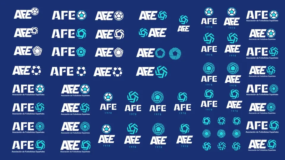
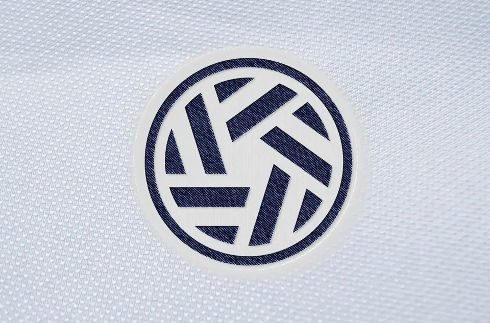
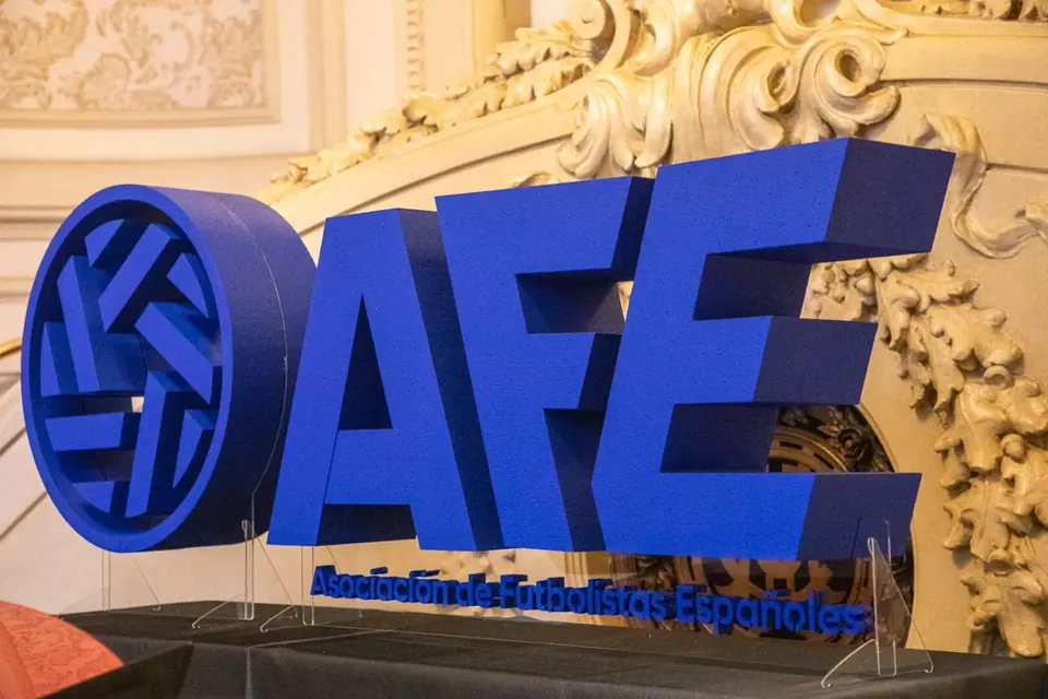
A brand built from its history: the interlocking hands symbol evolves into a geometric icon, with navy blue as the colour of solidity and trust.
3 · Applications
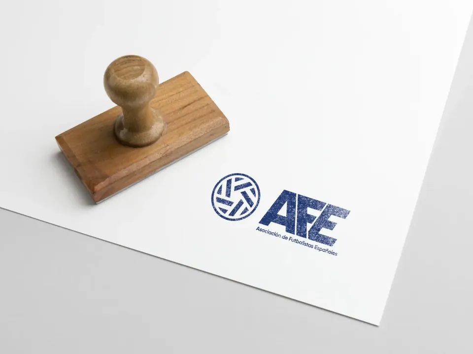
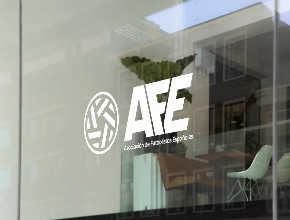
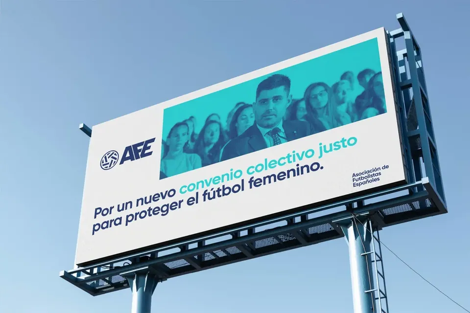
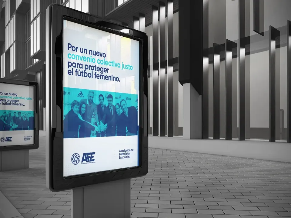
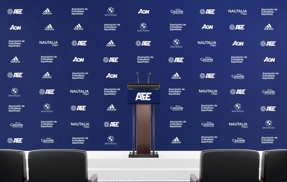
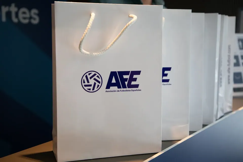
From the envelope to the stadium.
4 · Digital
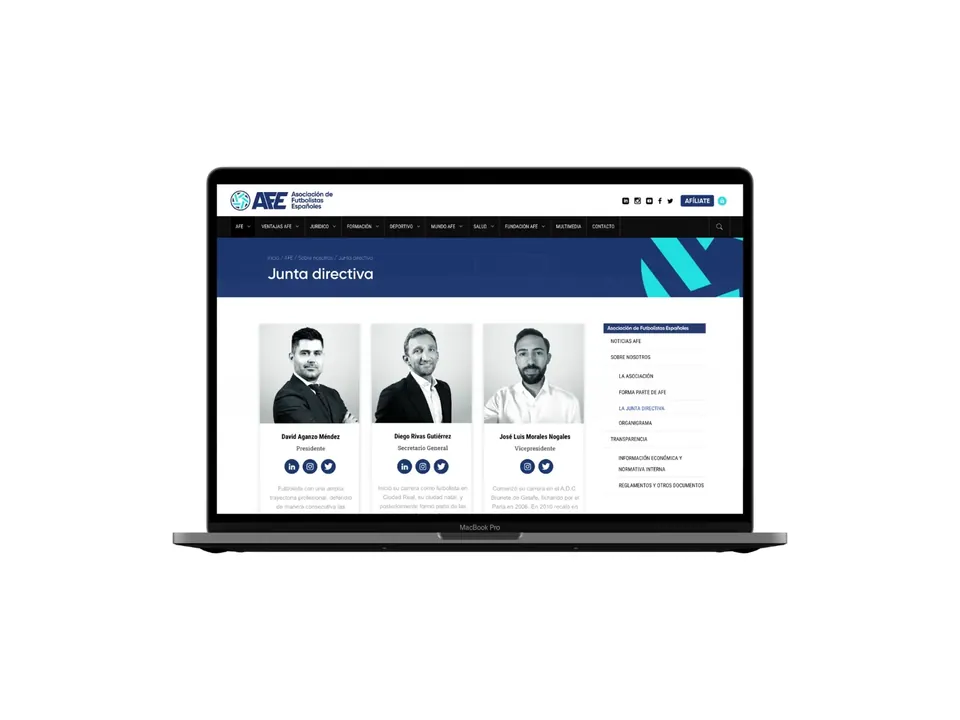
Website and social media, with the same voice.
5 · Launch
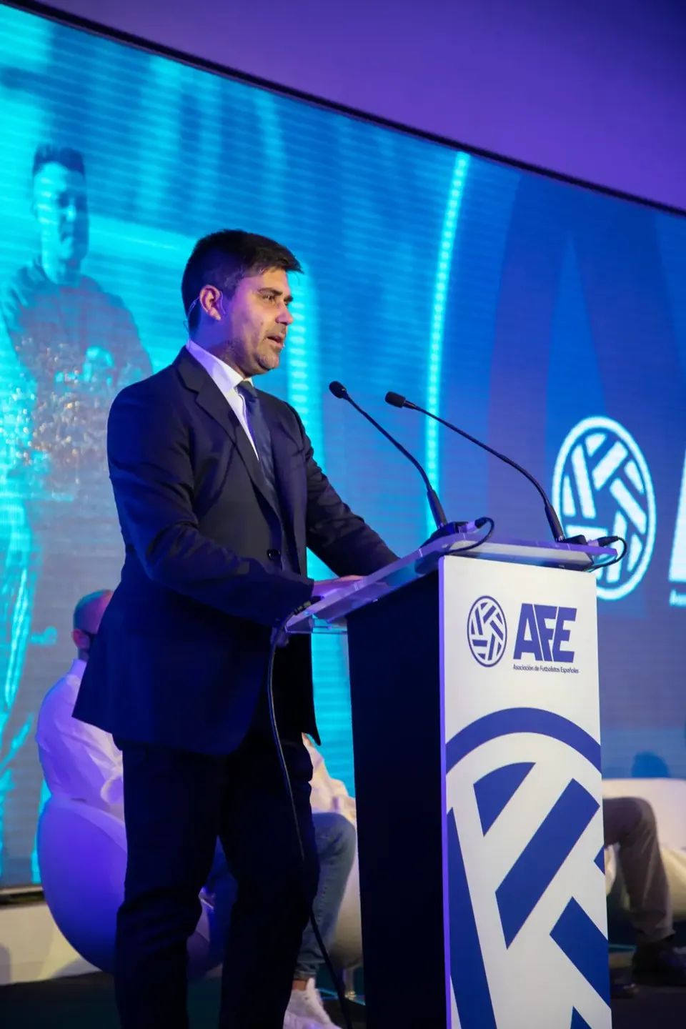
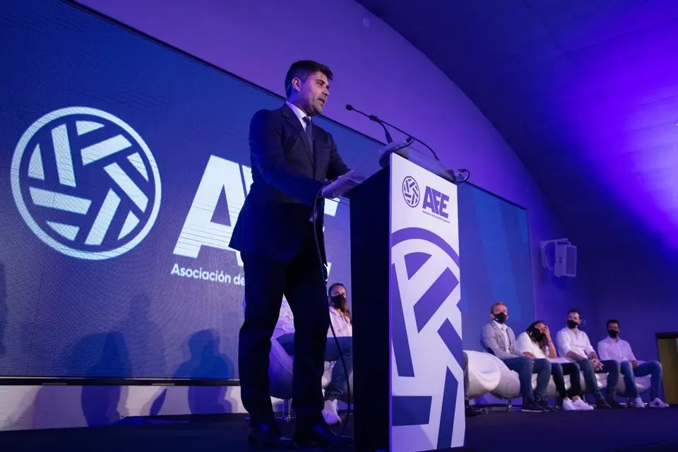
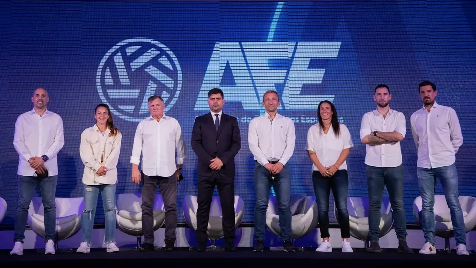
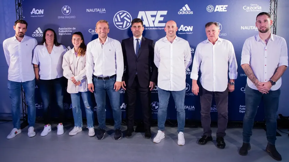
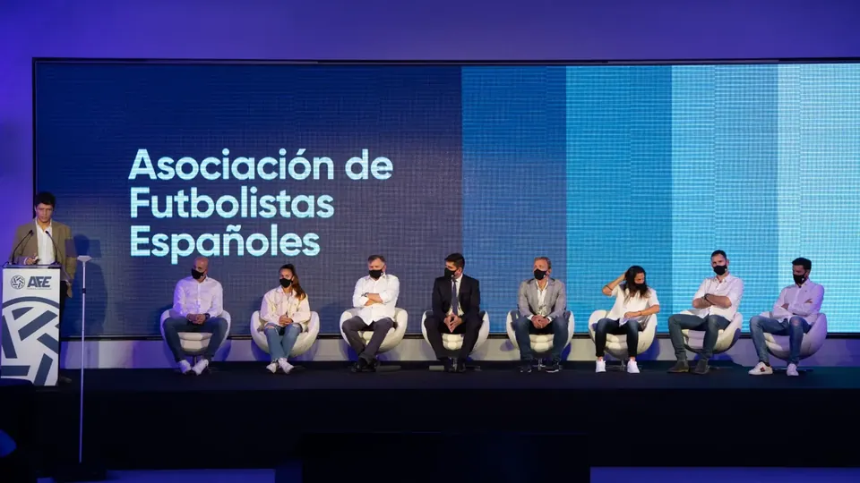
A new brand, launched with the footballers.
6 · Trophies
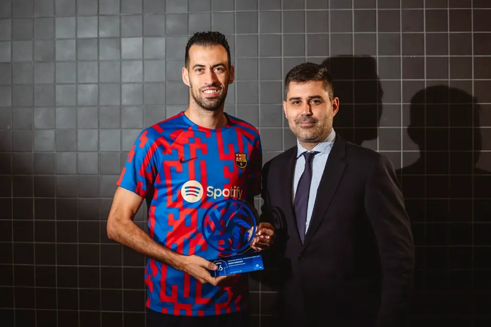
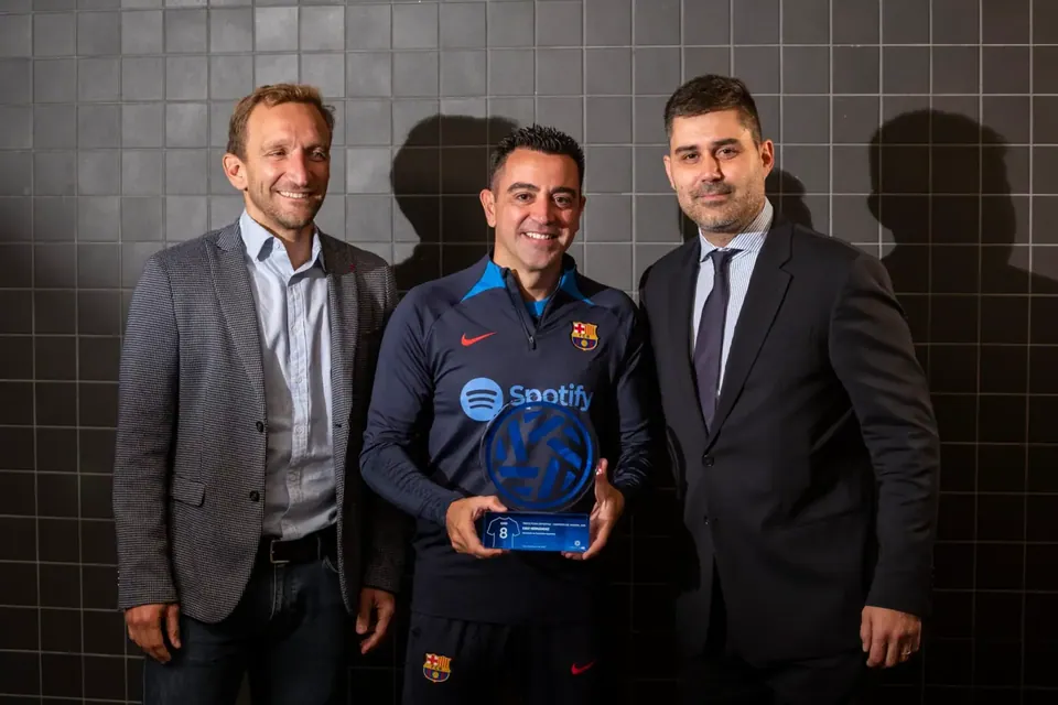
The brand, also on the awards.
The new symbol also became the trophy AFE presents to footballers.


Beyond sport
Other case studies.

AFE ×Rebranding
A new identity for the Spanish Footballers' Association: logo, symbol, colour, typography and all its applications, from stationery to the official launch.
AFE refreshes and modernises its identity to keep conveying its values and purpose: to guarantee the best defence of footballers' interests. Respecting its essence and reviving elements of previous logos, we built a flexible brand on clean, dynamic and modern geometry.
1 · The story
A renewed collective, with the same history as ever.
The challenge
Update the image of an association founded in 1978 without losing its essence or the trust of the footballers it represents.
The idea
Go back to its historic emblems, such as the interlocking hands, and redraw them with clean geometry in navy blue, which conveys solidity, transparency and trust.
The execution
A complete system: logo, symbol, colour, typography and sub-brands, rolled out across stationery, signage, website, social media and the official launch of the new brand.
2 · The brand
Logo, symbol, colour and typography.
A brand built from its history: the interlocking hands symbol evolves into a geometric icon, with navy blue as the colour of solidity and trust.
3 · Applications
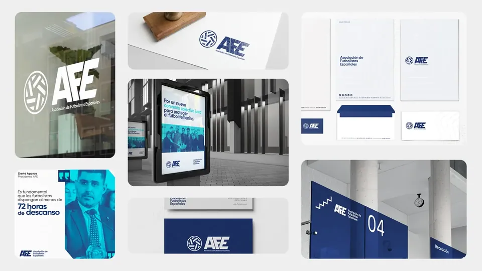
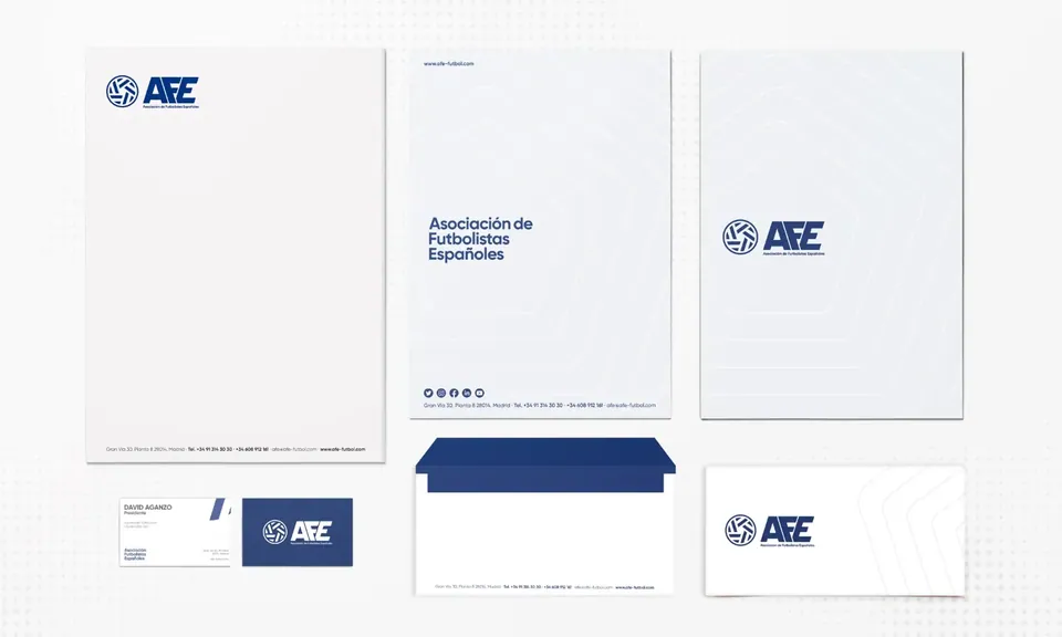
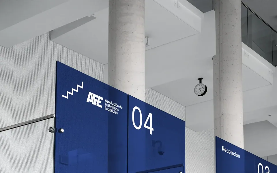
From the envelope to the stadium.
4 · Digital
Website and social media, with the same voice.
5 · Launch
A new brand, launched with the footballers.
6 · Trophies
The brand, also on the awards.
The new symbol also became the trophy AFE presents to footballers.
Other case studies
Beyond sport